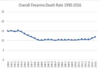
Numbers are a powerful tool when used properly. Like all powerful tools, they can be used for good or to deceive. On one hand, the Violence Policy Center’s chart is not factually untrue. On the other, of course, the snapshot is purposefully timed to mislead the reader. Are both sides guilty or have the anti gunners run amok?

Last week, the Violence Policy Center shared its analysis of 2016 fatal injury statistics, which are released by the Centers for Disease Control and Prevention and available for public analysis. The Violence Policy Center’s headline: “U.S. Gun Death Rate Jumps 17 Percent Since 2008 Supreme Court District of Columbia v. Heller Decision Affirming Right to Own a Handgun for Self-Defense.”

That appears to suggest causation as if the Heller decision somehow has driven people to commit crime. The chart in the press release is even more disingenuous than the headline. Take another look. A casual look at the chart gives the impression that the firearm death rate has skyrocketed—the marker went from near the bottom of the chart in 2014 almost all the way to the top! The axis runs from 10.0 to 12.5; this technique is commonly used to make numbers seem more dramatic.
Take a look at the same data point—the overall firearm death rate in the U.S.—on a chart with a more honest axis and not only will you have the full story, hopefully, you’ll be a bit more weary the next time you see a graph.
Do you have an example of the anti gunners have attempted to manipulate the data? Share it in the comment section.
Sign up for our weekly newsletter and discounts here.

Leave a Reply